The Dark Home Gym: 12 Moody Design Ideas That Don’t Feel Like a Bro Cave
There are two kinds of dark home gyms.
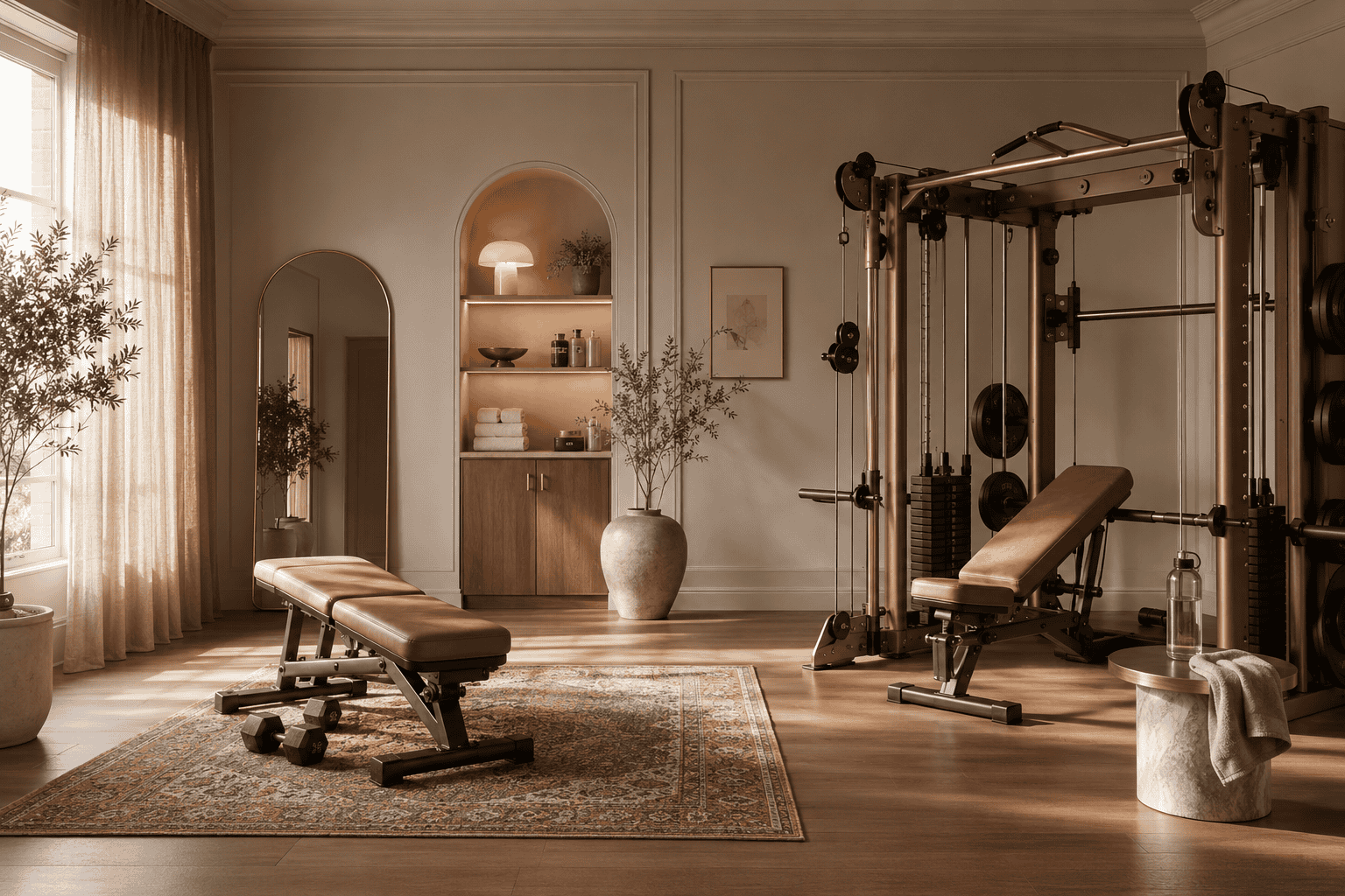
One looks like a hotel spa at 9pm. Charcoal walls, brass fixtures, warm wood, a single low lamp in the corner, equipment that feels designed instead of dropped in.
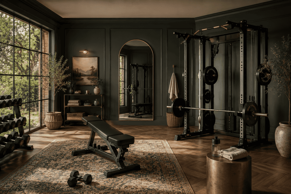
The other looks like the inside of a parking garage. Black rubber, chrome, that one fluorescent tube that flickers, a free poster from a supplement company, a shaker bottle on the floor.
Same color palette, completely different rooms. The difference is design discipline, not budget.
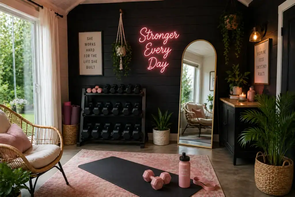
A dark home gym is a workout space built around deep, low-saturation tones (charcoal, black, deep green, terracotta, warm brown) layered with warm lighting and natural textures, so the room reads as moody and intentional instead of harsh and cold. Done well, it is the most forgiving aesthetic you can pick. Dark walls hide marks, dark equipment matches itself, and warm lighting fills in the rest.
I trained in interior design at FIDM in Los Angeles, where color, aesthetics, and space planning were the three specialties on the degree.
Dark rooms are the problem I have spent the most time looking at on paper before solving them at home. I have set up home gyms in five different rooms across three states (a small LA apartment, a Portland bedroom, a garage apartment, and now a North Idaho basement), and the two that worked best were both intentionally dark. The principles are not complicated. The execution is where most home gym content stops.
Here are 12 dark home gym ideas that lean moody without tipping into bro cave.
1. Pick a Saturation Lane and Stay In It
The fastest way to make a dark gym look amateur is mixing saturation levels. A pure black wall next to a charcoal sofa next to a faded grey rug looks accidental, even though all three are dark.
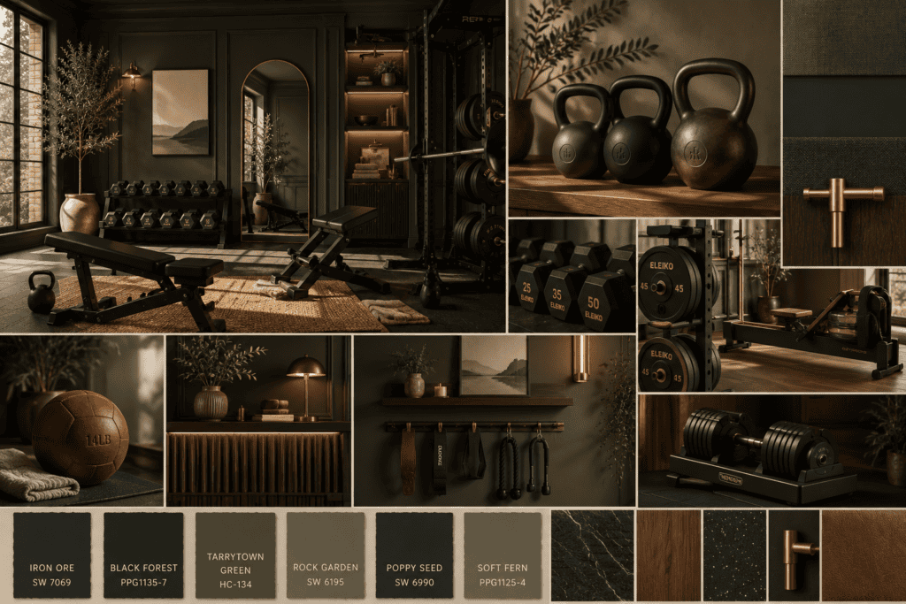
Pick one depth and let several colors live inside it. A moody palette can hold black, deep forest, warm terracotta, charcoal, and a smoked oak finish, as long as every piece sits at roughly the same depth.
The principle is match saturation, not color. Variety inside one saturation reads as designed. One repeated color reads as flat.
Color theory at FIDM hammered this in early. Saturation is what the eye reads first, color is what it reads second, and most amateur palettes get those in the wrong order.
Pro Tip: Hold paint chips up next to your floor sample and your equipment side by side, then squint. If one piece pops out lighter or darker than the rest, it is the wrong saturation. The squint test is the single most useful thing I learned in two years of color classes.
2. Skip Pure Black for Your Walls
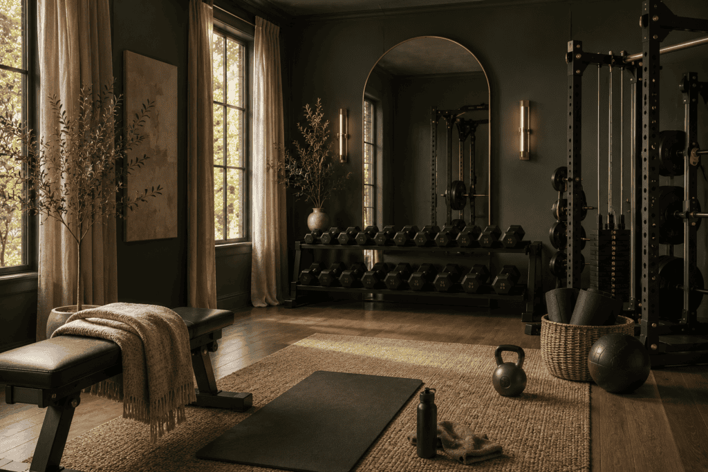
Pure black walls in a small or low-ceilinged room can feel like the room is closing in. Most rooms read better with a near-black: a warm charcoal, a deep brown-black, or a black with green or blue undertones.
Sherwin-Williams Tricorn Black is closer to true black. Iron Ore reads warmer and softer in a small space. Caviar by Benjamin Moore has a slight warmth that keeps it from feeling sterile.
Test the color on the actual wall in actual light before you commit. Black paint shifts more than any other color depending on the room. I tested three near-blacks in our basement (Tricorn, Iron Ore, and Urbane Bronze) before landing on Iron Ore, and the difference between samples one and three at 7am versus 7pm was dramatic enough that I would have hated two of them by month two. Paint a 24-by-24-inch swatch of every option you are considering and live with it for at least three days at three different times before you commit a wall to it.
Pro Tip: Paint the ceiling the same color as the walls in a small dark gym. It removes the visual seam that makes a low ceiling feel lower, and the room reads as intentional cocoon instead of cramped basement.
3. Lean on Warm Wood, Not Chrome
Chrome and stainless steel are what make most dark gyms feel like a parking garage. They reflect cold light, they show every fingerprint, and they read as commercial.
Swap to warm wood and matte black wherever you can. Wood dumbbell racks, beechwood barre handles, oak shelving, leather grip wraps. Even one wood element in a sea of black equipment is enough to soften the entire room.
If you cannot swap the equipment itself, swap what surrounds it. A wood floor under matte-black weights reads completely differently than a rubber floor under the same set.
Pro Tip: Walnut and oak are the two most forgiving wood tones in a dark room. Lighter pine reads cheap against deep walls. Cherry can lean too red.
4. Layer Three Light Sources Minimum
A dark room with one ceiling light is a cave. A dark room with three light sources is a sanctuary.
The three layers: a dimmable overhead, a floor lamp or sconce in the corner, and an accent strip behind a shelf or under a bench. All three on warm bulbs (2700K to 3000K) on dimmers if possible.
For the full breakdown on each layer, see home gym lighting ideas.
Pro Tip: Plug the accent strip into a separate switch. The night you want to stretch with only the floor lamp and the strip on is the night the room earns its keep.
5. Add One Anchor Piece You Actually Love
The thing that kills the cookie-cutter feeling in a dark gym is one item you genuinely love. The basket you would put in your living room. The framed art that catches your eye when you walk past it. The kettlebell that looks like a sculpture.
Spend on that piece. Fill in around it with cheaper basics. The eye goes to the special pieces, so the rest of the room can be plain matte black and still read as designed.
In design school the move is anchor first, accessorize second. Pick the hard-to-source piece you love, then build outward.
Pro Tip: The anchor piece does not have to be expensive. A vintage bench from a thrift store, a hand-thrown ceramic plant pot, a single linen runner. It just has to be a piece you would not have picked at random.
6. Use a Rug That Grounds the Floor
A jute, wool, or low-pile vintage rug in a deep tone gives your workout area a defined edge without permanent flooring changes. The rug tells the eye where the gym ends and the rest of the room begins.
For a moody space, look for rugs in muted plum, deep olive, faded rust, or charcoal with a soft pattern. Avoid bright colors or high-contrast geometrics, which fight with the rest of the palette.
Place the rug around your workout zone, not under it. You want the mat on a hard surface for stability, the rug as a frame.
Pro Tip: Vintage rugs hide gym wear better than new ones. A small mark on a rug that already has character disappears. A small mark on a brand-new rug stares at you.
7. Treat the Mirror Like Furniture, Not Equipment
A leaning full-length mirror with a black or oak frame reads as an interior design choice. A frameless gym mirror screwed to the wall reads as commercial.
If you want the form-checking function without the studio feel, lean a tall framed mirror against the wall instead of mounting it. Frame thickness matters: thin reads modern, thick reads heavier and more residential. Pick what matches the rest of the room.
In my LA apartment days, leaning a full-length mirror against the wall was usually the only legal option. I could not drill, I could not anchor, I could not modify anything beyond hanging removable hooks. I bought a six-foot oak-framed mirror at a flea market for forty dollars, leaned it against the wall behind my dumbbells, and that single piece did more for the corner than any other purchase that year. Renters and homeowners both: the leaning move reads as design choice, not workaround.
Pro Tip: Set the mirror at a slight angle off the wall, not perfectly flush. The angle catches light differently and makes the corner feel intentional instead of accidental.
8. Pick Matte Equipment Over Glossy
Glossy black plastic shows every smudge, reflects light unevenly, and reads cheap. Matte black absorbs light, hides wear, and matches almost any other dark finish.
When you buy new equipment, look for “matte” or “powder-coated” finishes specifically. Matte adjustable dumbbells, matte kettlebells, matte storage racks. The whole room calms down when nothing in it is shiny.
If you already own glossy gear, a single coat of matte protective spray or a powder-coat refinish service can change the look without replacing anything.
Pro Tip: Matte black equipment also photographs better. If you ever post your space, the glossy stuff is what blows out under flash and ring lights.
9. Add One Plant That Likes Low Light
Dark rooms still need life. One plant in a deep ceramic pot does more than ten pieces of wall art ever will.
The forgiving picks for a dim room: snake plant, ZZ plant, pothos, cast iron plant. All four tolerate low light, irregular watering, and the dust that accumulates in any active space.
Place the plant somewhere it catches whatever natural or accent light you have. Leaves backlit by a window or an LED strip read as alive. Leaves in pure shadow read as a chore.
Pro Tip: Pick a pot one shade lighter than your wall color. A black pot on a black wall vanishes. A warm terracotta pot on a black wall pulls the eye and adds saturation variety.
10. Hide the Cables, Hide the Cords
Nothing makes a moody, intentional space look like a college dorm faster than visible charging cables and tangled cords.
Run cords behind shelves, along baseboards, or through cable management sleeves. Tuck the spray bottle, the wipes, and the spare resistance bands into a closed basket or a small cabinet.
A dark space punishes clutter more than a bright one. The lower the light, the more your eye gets caught on the wrong things.
Pro Tip: A single closed-front basket on a low shelf solves most clutter. Visible storage on its own is fine. Visible storage of ugly necessary objects is what kills the vibe.
11. Echo the Palette with One Soft Texture
Hard surfaces only (wood, metal, mirror, rubber) read as gym. Adding one soft texture is what tips the room back toward room.
A linen curtain, a wool throw folded over a bench, a sheepskin draped on a chair, a knit cushion in a corner. Pick something in the same saturation lane as the rest of the room, in a natural fiber.
You will not work out in it. The textile is not for use. It is there because the human eye reads softness as comfort, and a workout space your eye reads as comfortable is a workout space you walk into instead of past.
Pro Tip: Wool and linen handle humidity better than cotton in a workout space. If you sweat heavily or run cardio, skip cotton textiles within arm’s reach of the mat.
12. Let the Room Be Dim Enough to Wind Down In
The biggest design failure of most home gyms is that they only work at one energy level. Bright fluorescents only know how to do “high alert.”
A dark home gym, designed correctly, can hold a Tuesday afternoon strength session and a Sunday evening stretch in the same square footage. Dimmers, layered lights, warm bulbs, soft textures, one anchor piece, hidden clutter. That is the whole brief.
For more on building moody aesthetic that adapts: – 12 Aesthetic Home Gym Ideas You’ll Actually Want to Copy – 10 Modern Home Gym Ideas That Don’t Take Over Your Room – Home Gym Lighting Ideas: How to Light a Space You Actually Want to Be In
A dark home gym should feel more like a hotel spa at 9pm than a fluorescent studio at 7am. Get the saturation right, get the lighting right, and the rest is a question of restraint.
Moody Done Right Is Mostly Restraint
A dark home gym goes wrong in the same two ways every time. Too much pure black with no variation, or one bright cold light source canceling the entire palette.
Pick one saturation lane. Layer warm light. Add one anchor piece. Hide the cables. Let one soft texture in. That is most of the work.
The rest of the room will follow.
Download The 5-Minute Home Gym Setup Checklist — a quick-start guide to choosing your space, your equipment, and a setup that looks as good as it works.

Free 5-Minute Home Gym Setup Checklist
You don’t need a full home gym. You just need a corner.
No spam. Unsubscribe anytime.
Build it dark. Build it warm. Build it like a room you actually want to spend an hour in.